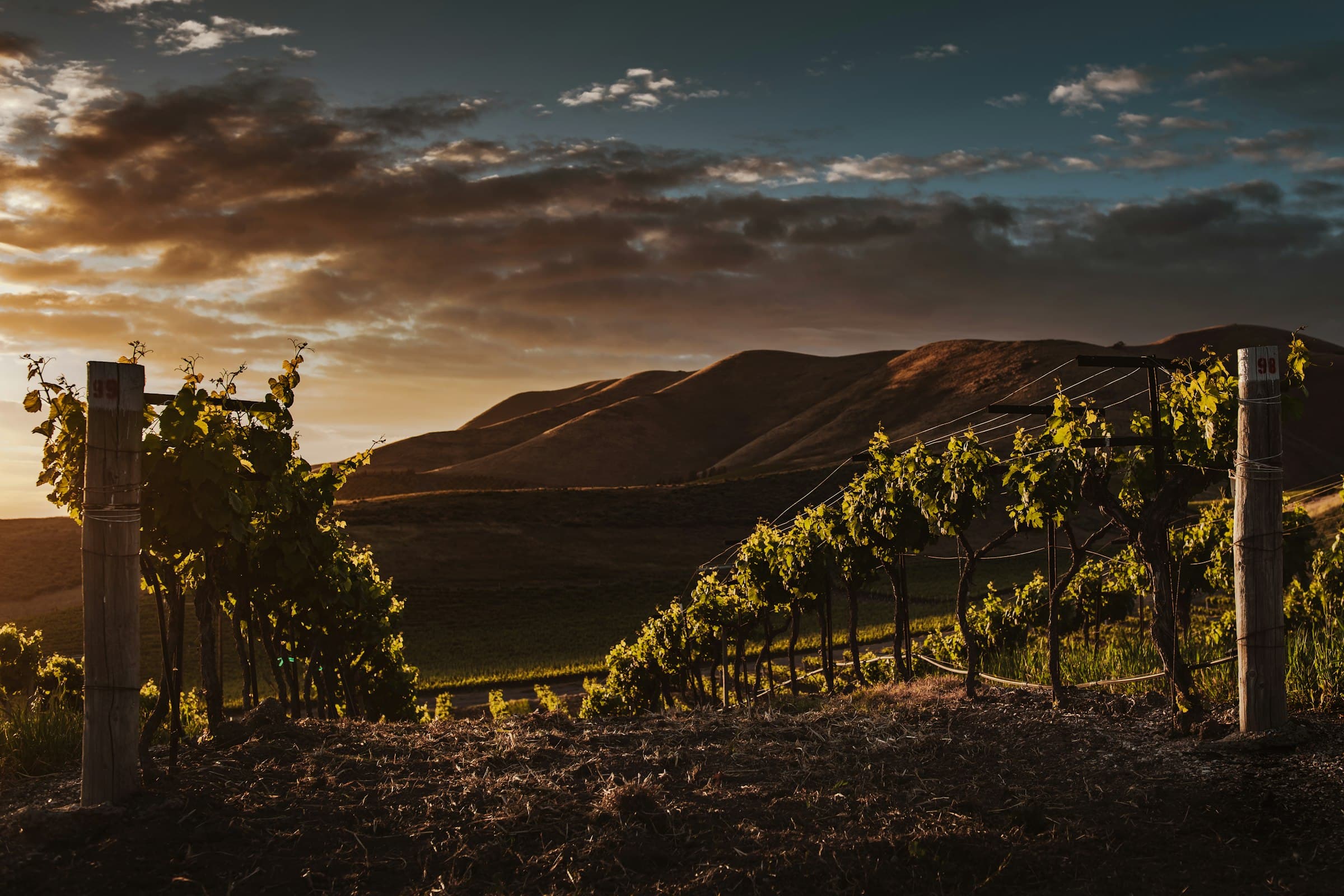
A self-initiated concept build. Amberlow Vineyard is a fictional brand, invented for this project.
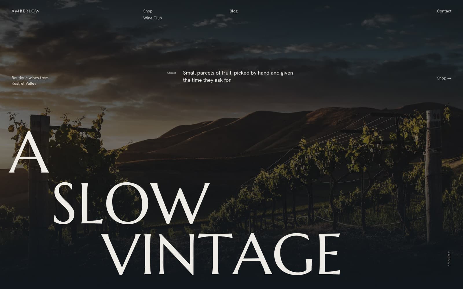
The homepage, full-bleed hero, a cascading display headline and scattered annotation labels.
A small-batch winery with a strong sense of place needed a site to match: editorial and slow, rooted in Kestrel Valley’s clay-loam terroir, without the gloss of a typical drinks brand. The work had to feel grown, not marketed.
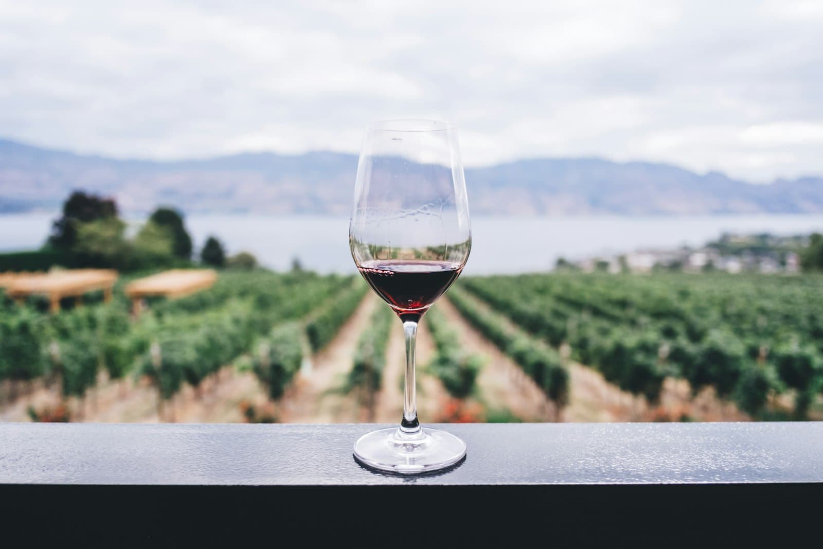
A motion-led site in Next.js: scroll-driven reveals, GSAP parallax, a tall flared-serif display (Marcellus) over a grotesk body (Hanken), on a near-black palette. Original copy carries a “slow vintage” idea across Home, Shop, Blog and Contact at a calm editorial rhythm.

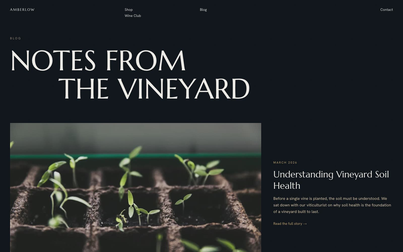
Notes from the vineyard, an image-led editorial blog, featured post leading.
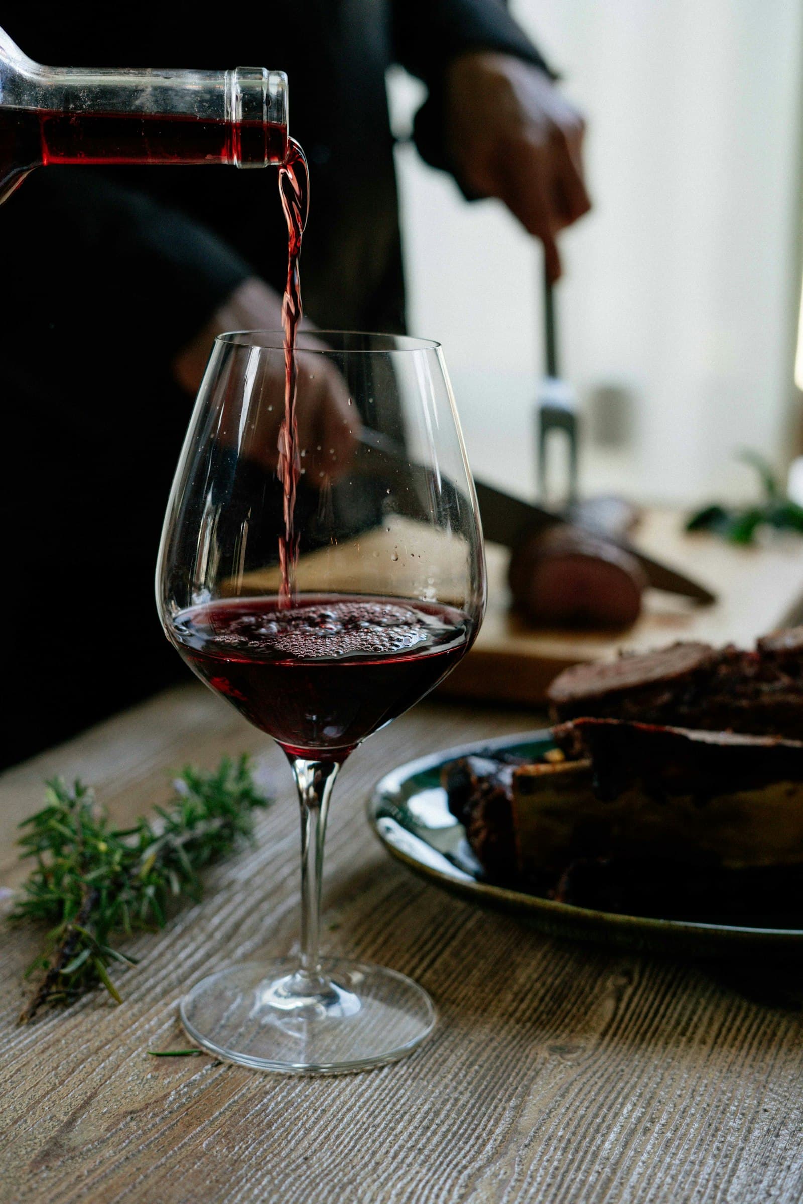
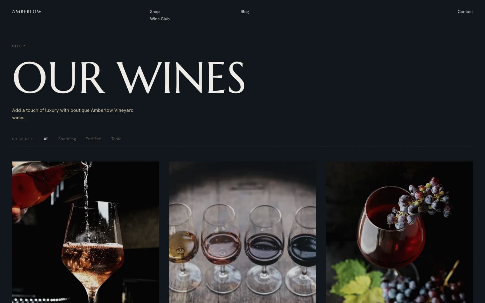
A short, considered range shown on an asymmetric gallery: varied scales, plenty of air, more art-object than product grid. Each release treated as its own small edition rather than a catalogue row.

A members-first wine club: exclusive releases, artist-edition releases and evenings at the Barrel Room, woven through the site as a quiet, recurring invitation rather than a hard sell.
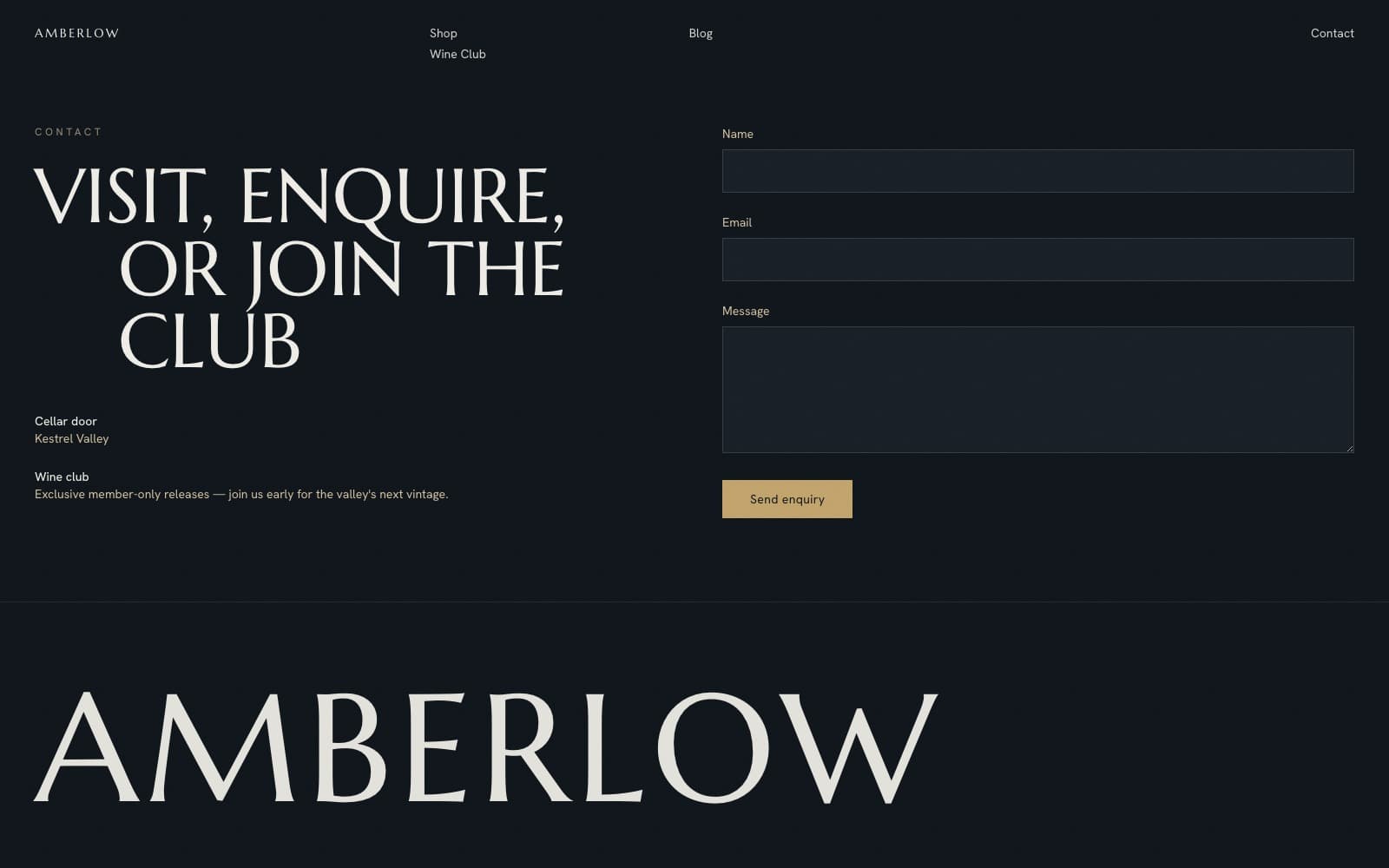
Marcellus (flared serif display) over Hanken Grotesk (grotesk body): editorial, unhurried.
Restrained, poetic, place-led. Few words, large imagery: terroir over gloss. “Low yields, small berries, concentrated fruit that tastes of exactly one place.”
- Scope
- Front-end design · build
- Stack
- Next.js · Tailwind · GSAP
- Type
- Serif display · sans
- Status
- Live